From Manuscript to Typeface: Bettona Old Style and Bettona Elephant
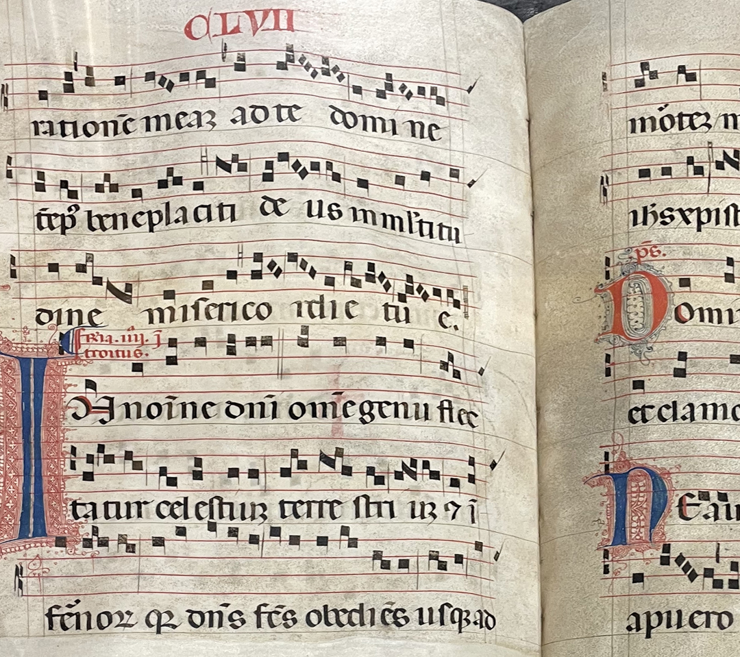
The Bettona type project is a practice-based investigation into the relationship between historical manuscript culture and contemporary type design. Developed through the study of I Corali di Bettona, a group of medieval liturgical manuscripts preserved in the Umbrian town of Bettona, the research examines how the structural principles of historical writing can be translated into a coherent digital typographic system.
The Corali were produced as large-format books for collective reading and vocal performance. Their writing was therefore conditioned by scale, distance, illumination, rhythm, and architectural space. Rather than treating the manuscripts as decorative references, the project approaches them as complex systems in which ductus, stroke modulation, proportion, counterform, spacing, and visual rhythm operate together.
Fred Smeijers describes type design as requiring “a visual sensibility; knowledge of use and its history; a sense of craft” (Smeijers, quoted in Thomson 2015). These interdependent forms of knowledge are central to the Bettonaa research. Historical analysis was combined with drawing, optical judgement, digital construction, spacing, and repeated contextual testing.
Observing the Manuscript System
The historical letterforms were studied through sustained visual observation rather than formal measurement. Particular attention was given to recurring relationships between vertical stems and curved strokes, the compression of internal counters, the orientation of terminals, the behaviour of shoulders and joins, and the rhythm generated by alternating black and white forms across the manuscript page.
The same letter frequently appears in several different configurations. Its form may change according to the movement and pressure of the hand, the angle of the writing instrument, the available space, neighbouring letters, and the physical behaviour of ink and parchment. These variations were not understood as defects requiring correction. They provided evidence of the underlying generative logic of the script.
The research consequently distinguished between structural characteristics and incidental irregularities. Historical forms were not traced or reproduced literally. Instead, persistent tendencies were abstracted and translated into a contemporary framework through comparative drawing, digital outline construction, optical correction, spacing, kerning, and testing in words and continuous text.
Stroke, Counterform, and Typographic Space
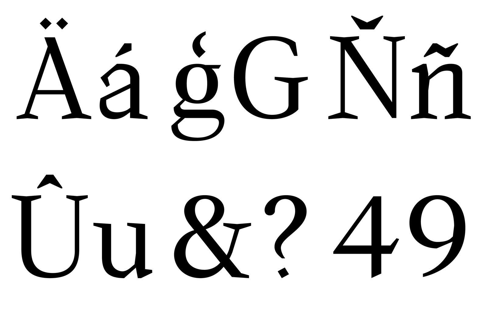
The analysis began with the ductus of the manuscript writing: the direction, sequence, velocity, and pressure through which its strokes were formed. The contrast between thick and thin elements was interpreted as a consequence of movement and broad-edged pen behaviour rather than as a decorative treatment applied to a finished skeleton.
The design process nevertheless extended beyond the analysis of black strokes. Each letter was considered as an interaction between contour, counterform, aperture, sidebearing, and the external white space produced between adjacent characters.As Gerrit Noordzij writes, “the relation between shape and countershape, which in writing amounts to the relation between white and black, is the foundation of perception” (Noordzij 2005, 14).
This principle became fundamental to the development of both families. Changing the thickness of a stem necessarily changes the counter it encloses; adjusting an aperture alters the movement of white through the form; modifying a sidebearing affects the rhythm of the word. The glyph could therefore never be treated as an isolated silhouette.
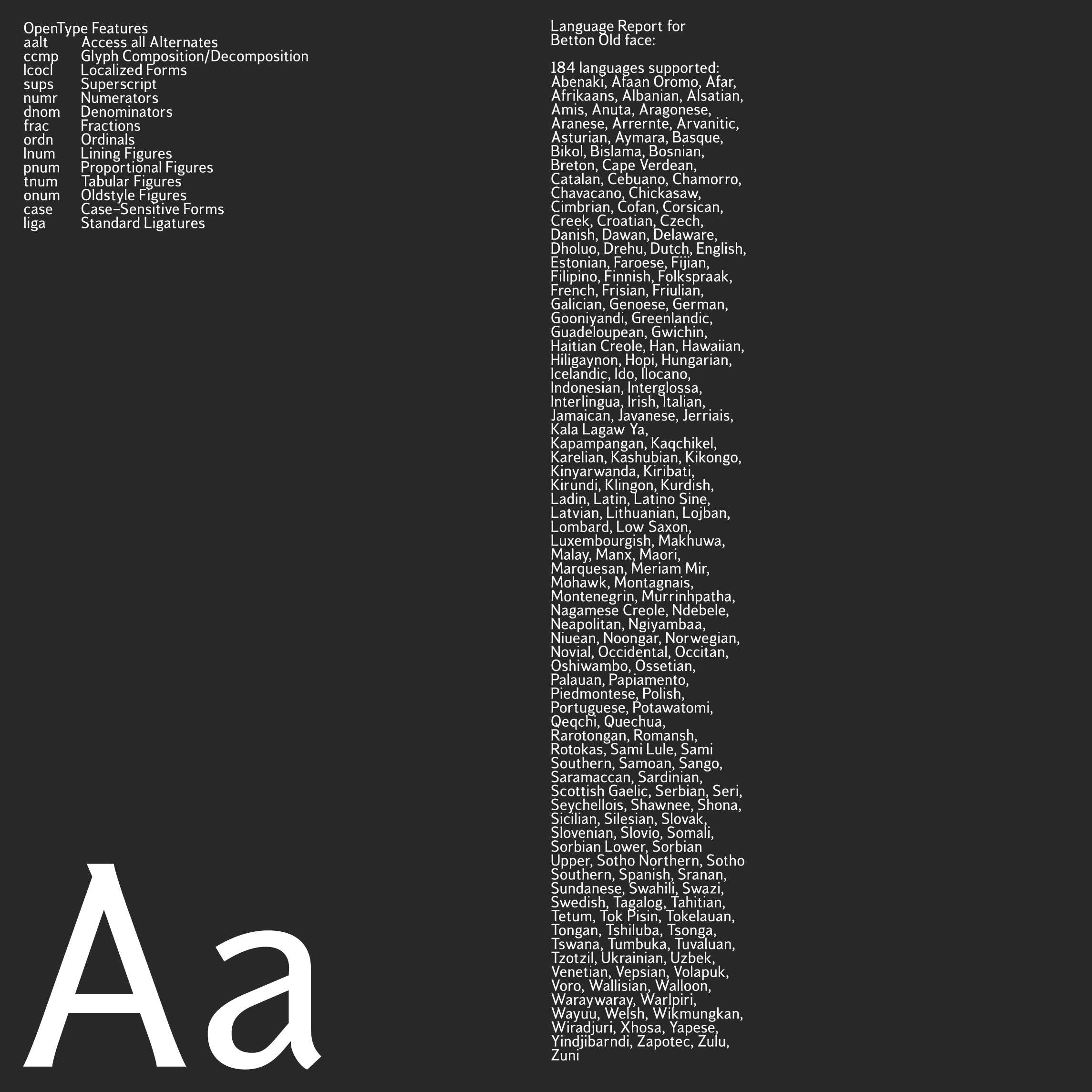
Bettona Old Style
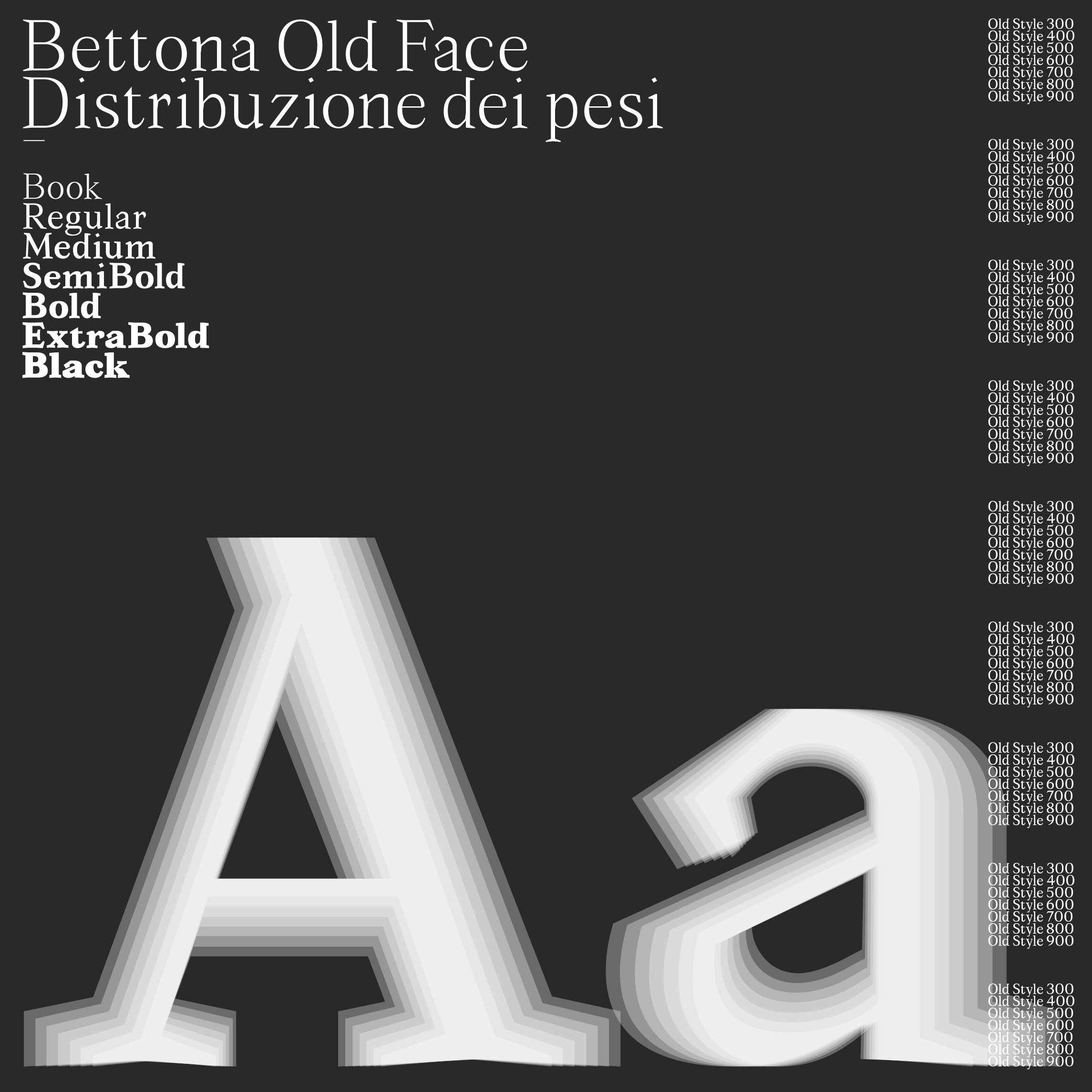
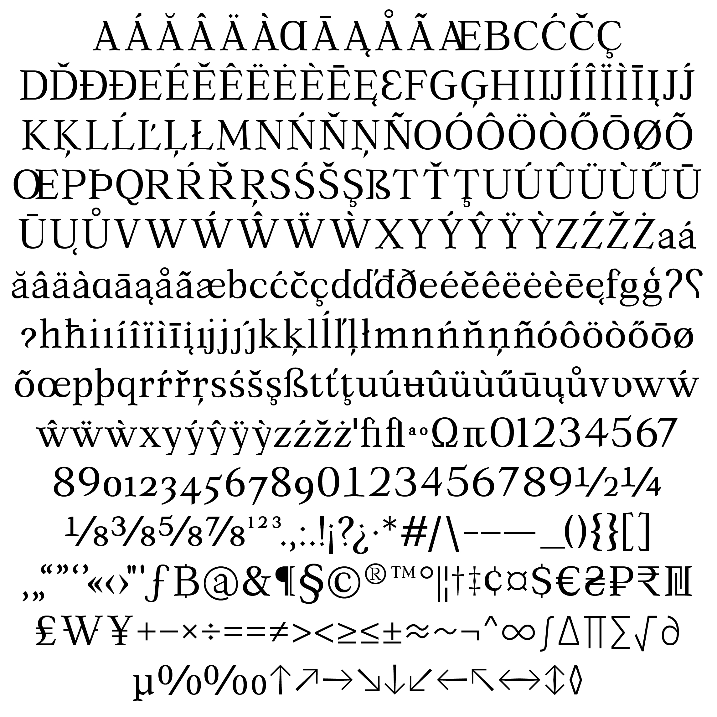
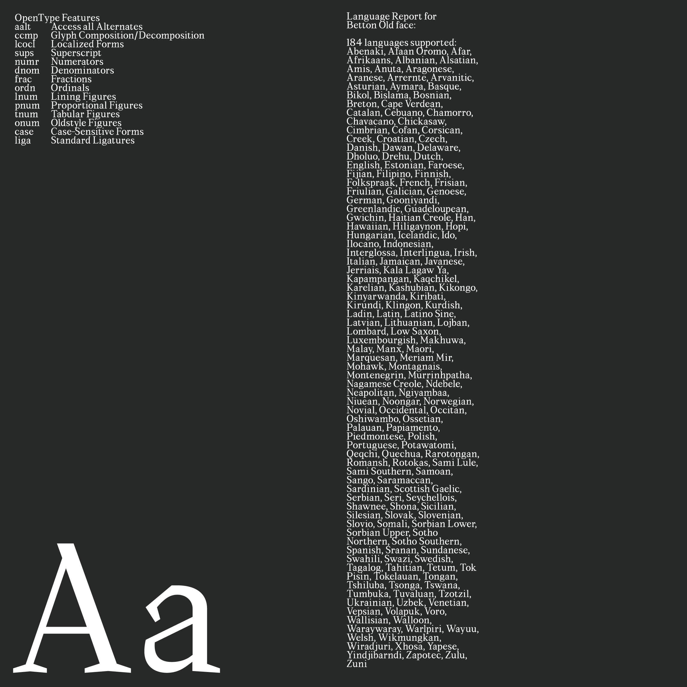
Bettona Old Style is the text-oriented expression of the manuscript research. It retains the density and controlled tension of the source through moderately compressed proportions, calligraphic stroke modulation, contained counterforms, differentiated serif structures, and subtle asymmetries within bowls, shoulders, and terminals.The family is not intended as a reconstruction of medieval writing. Its letterforms are contemporary, but they preserve evidence of their written ancestry. Narrow apertures, sharpened transitions, compact counters, and variations in terminal direction produce a typographic texture that remains perceptible during reading.
This relationship between perceptible character and functional recognition is supported by Gerard Unger’s observation that “most readers read without consciously recognizing the letters” (Unger 2007, 11). Readers do not normally inspect the anatomy of individual glyphs, yet they possess a highly developed, largely unconscious familiarity with letterform structures.Unger also notes that “the shapes of letters are firmly embedded in our minds” (2007, 10). The design of Bettona Old Style therefore operates through controlled deviation rather than arbitrary novelty. Distinctive details are introduced within recognisable alphabetic structures, allowing the typeface to retain a specific historical and formal identity without compromising the continuity of the word.
Sofie Beier’s research offers further support for this position. Her experiments found that “unfamiliar letter features only have an effect of preference and not on reading speed” within the conditions of her study (Beier 2009, 3). Unfamiliarity should not therefore be equated automatically with illegibility. What remains essential is the preservation of visibility, character differentiation, coherent spacing, and rhythmic consistency.
Bettona Elephant
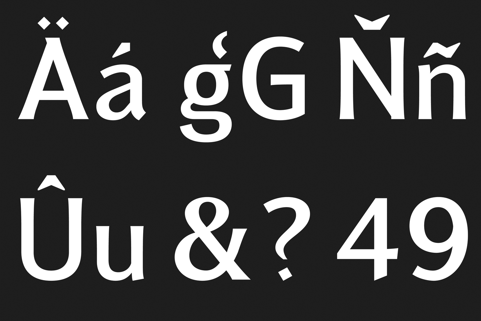
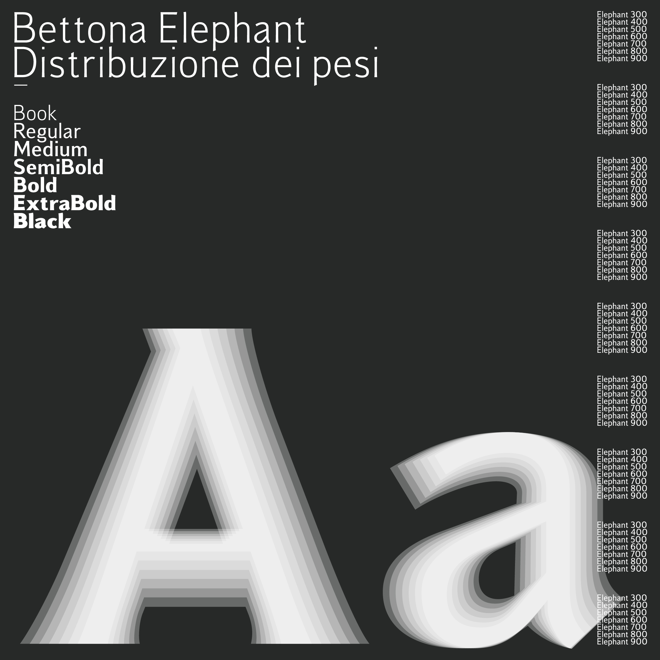
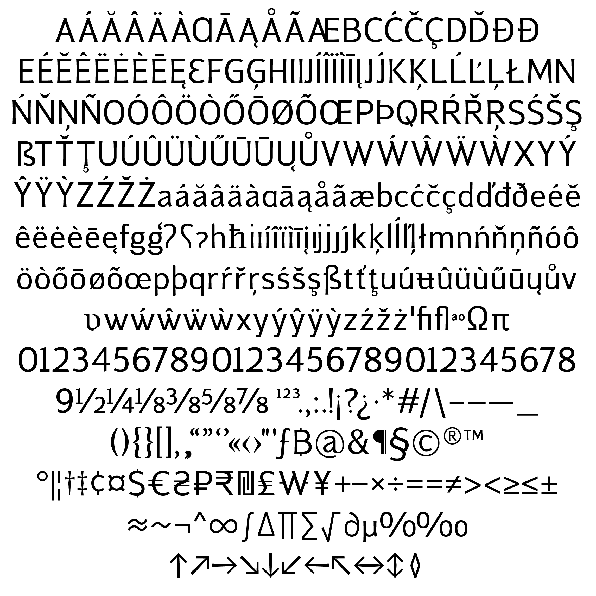
Bettona Elephant originates from the same manuscript-based framework but translates its structural logic into a display-oriented system. Its forms are characterised by increased stroke mass, reduced counterspace, pronounced vertical emphasis, and a more architectural relationship with the surrounding space.
The family was not created by mechanically emboldening Bettona Old Style. Such a process would have closed counters, congested joins, distorted curves, and weakened character differentiation. Each glyph required an independent redistribution of black and white.
Outer and inner contours were therefore developed separately. Counters and apertures were selectively protected, while notches, junctions, and internal corners were opened where necessary to control the accumulation of visual mass. Terminal structures were enlarged or redirected to strengthen the silhouette and improve recognition at distance.Where Bettona Old Style contains tension within the rhythm of continuous reading, Bettona Elephant projects that tension outward through scale, density, compression, and spatial force.
A Shared Typographic Structure
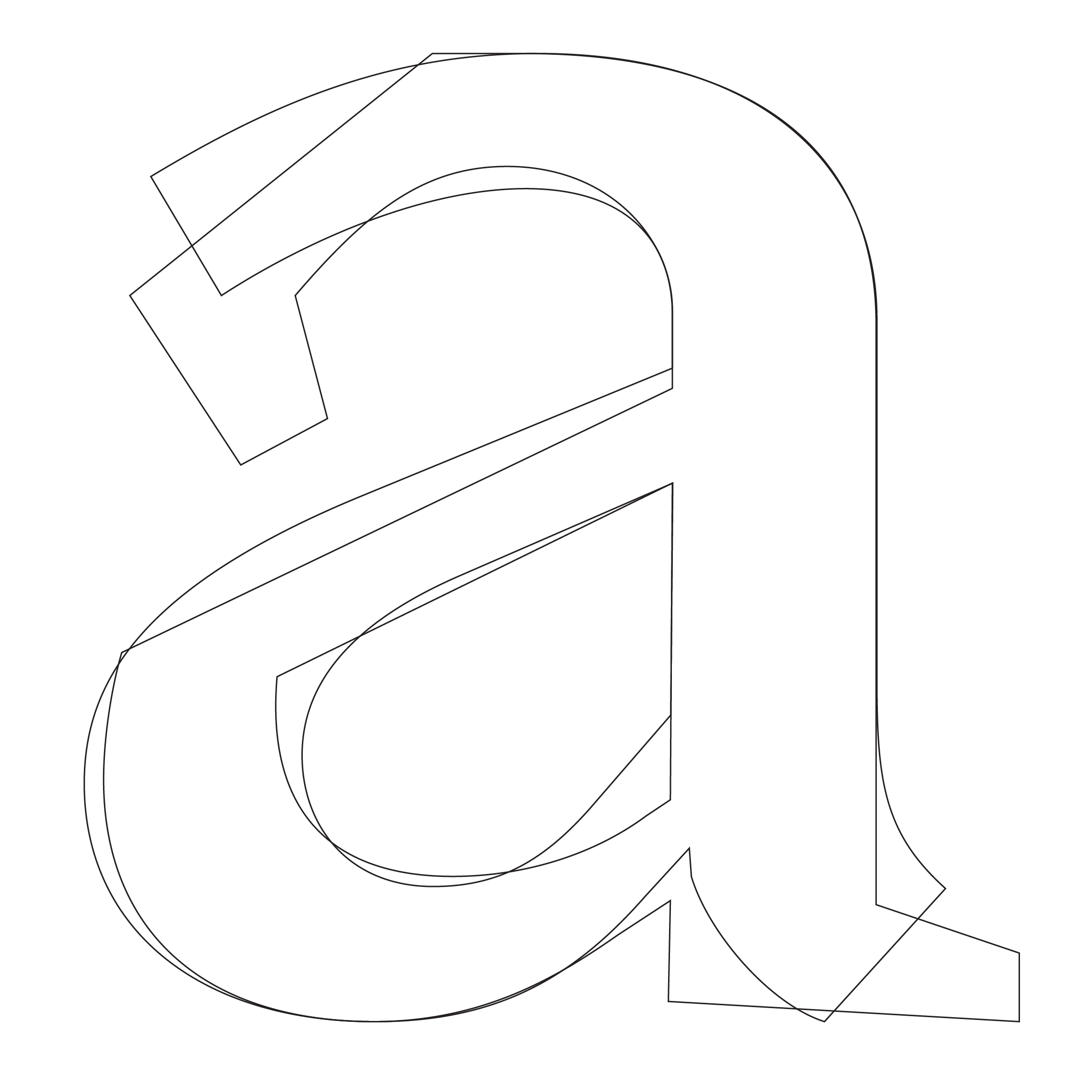
The relationship between the two families is founded on shared structural principles rather than superficial stylistic resemblance. Common shoulder positions, stroke directions, aperture behaviour, terminal orientation, character-width relationships, and distributions of internal space establish a recognisable genealogical connection.The two families should therefore not be understood simply as different weights of one typeface. Each possesses its own contrast model, counterform strategy, spacing logic, and optical behaviour. Their unity lies deeper, within the manuscript-derived system from which both were developed.
The project demonstrates how historical material can inform contemporary type design without being imitated or aestheticised. I Corali di Bettona are treated not as a repertory of antique forms, but as sources of typographic knowledge: records of gesture, rhythm, material behaviour, visual organisation, and collective reading.
Through Bettona Old Style and Bettona Elephant, this historical intelligence is translated into a contemporary digital language. The result is not a reconstruction of medieval writing, but a continuation of its underlying formal logic.

Selected Bibliography
Beier, Sofie. 2009. Typeface Legibility: Towards Defining Familiarity. PhD thesis, Royal College of Art.
Noordzij, Gerrit. 2005. The Stroke: Theory of Writing. Translated by Peter Enneson. London: Hyphen Press.
Thomson, Mark. 2015. “Reputations: Fred Smeijers.” Eye, no. 90, vol. 23.
Unger, Gerard. 2007. While You’re Reading. New York: Mark Batty Publisher.